
Tapestry Garden take two
my fabric selection process

Today life goes back to normal after the holidays. Children are back in school; adults are back at work. Many of us release a contented sigh as we settle back into cozy, comforting rhythms.
On my calendar for Stitched in Color? Selecting fabrics for a new Tapestry Garden quilt! That’s usually my favorite part of making a quilt, but this time I felt nervous…
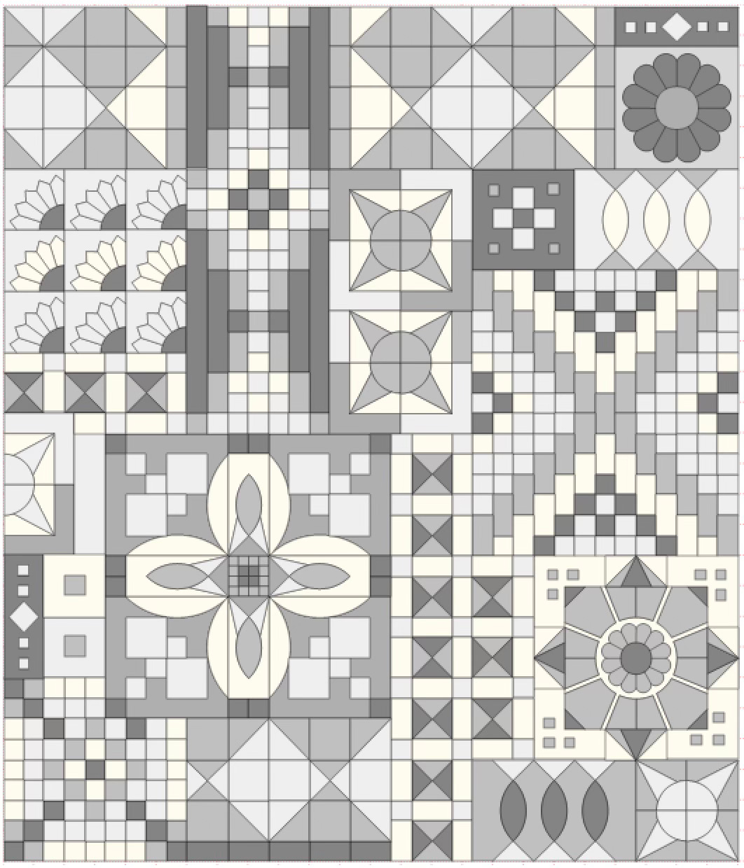
Do you remember when I shared this grayscale mockup of the quilt? A few readers remarked on the appeal of this simplified version, without color. Here the patchwork takes center stage, instead of the fabrics. It got me thinking… could I have the self-control to make something so devoid of color? And how might I feel about the result? I’ve already made a full spectrum version, so perhaps the opposite would be the most adventurous choice after all?
A grayscale version was an interesting concept, but I assumed I would go for something colorful, as usual, until inspiration hit me during the Christmas break. I could sew a quilt about mourning, about loss. About giving a place to the deep sadness I’ve encountered in my journey over the last three years.
Maybe that sounds like a terrible, depressing idea. It’s certainly a risk from a business perspective as people refer lighter content. But then, it does fit with what I wrote about in my Looking Back, Looking Forward post about wanting to do therapeutic sewing this year. And even if the quilt is about sadness to me as the maker, it might look pretty in the end???
Well, I’m going for it. I was feeling particularly sad this morning, and it felt like a sign on the day that I’m supposed to commit to a palette.
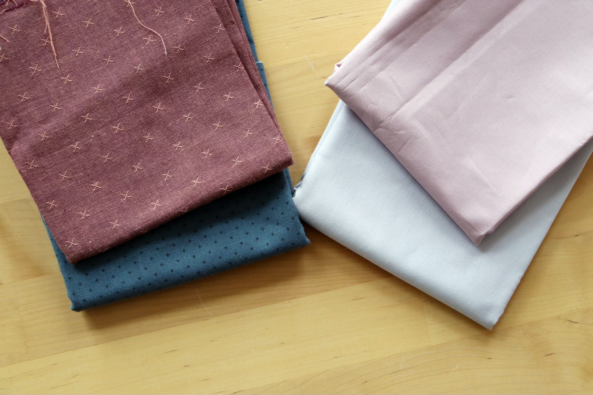
I started with the idea of gray + hints of desaturated purples. I’m focusing on grays with a neutral or blue tint, and excluding the green grays because they feel less somber. The two solids at top right are my idea for the solid elements of the Tapestry Garden quilt. One is a pale gray-lilac and the other is a pale mauve.
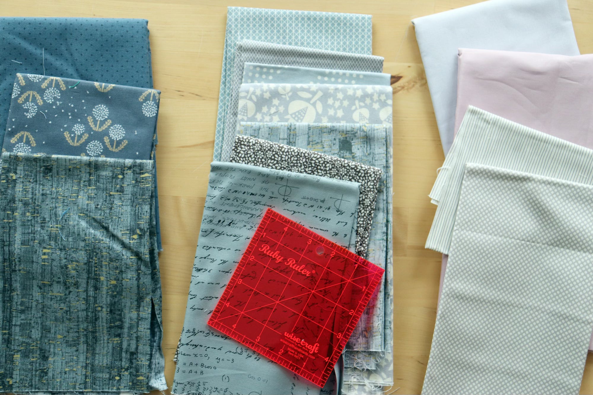
The Ruby Ruler helped me sort my grays into dark, medium and light values. Many of the prints have white elements, which can be challenging for value sorting. The Ruby Ruler does help, but there’s still a sense that some fabrics are hard to categorize. In the end I decided to exclude the floral print in the medium value stack (second from the bottom), as it falls in between dark and medium value.
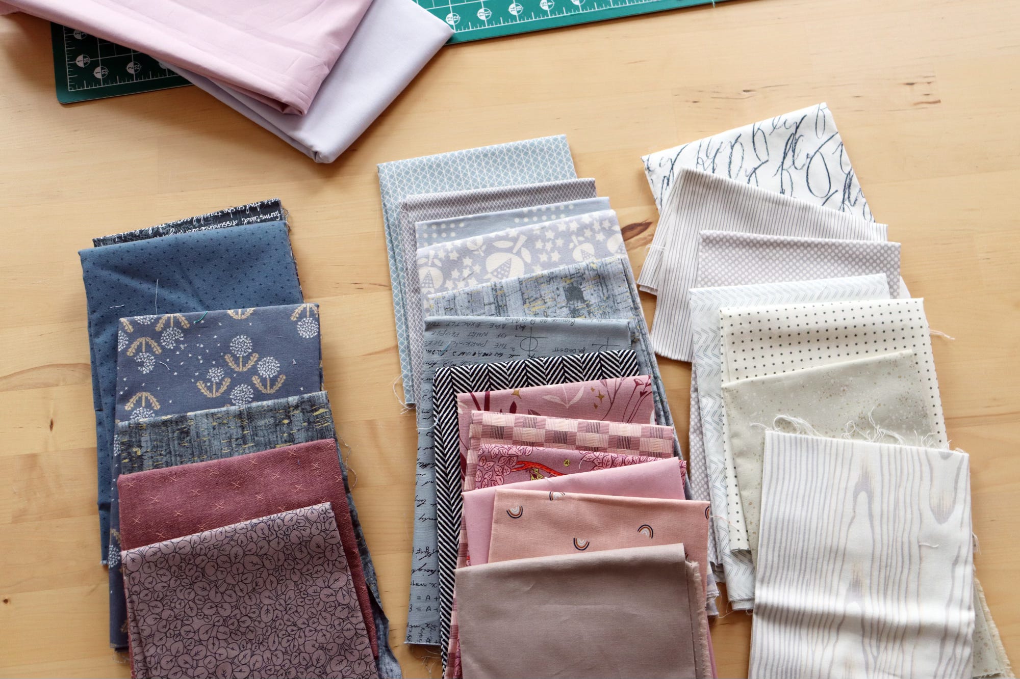
I didn’t have so many fabrics that fit the somber vibe (surprise, surprise), so I widened my palette to include a charcoal black and a purple-brown in the dark value pile. To the medium value pile I added a black/white herringbone, several mauve prints with brown undertones, an unsaturated peach and a soft brown to the original gray fabrics. Now I feel like I may have enough subtle variations to make this interesting for me. Am I already cheating? ;)
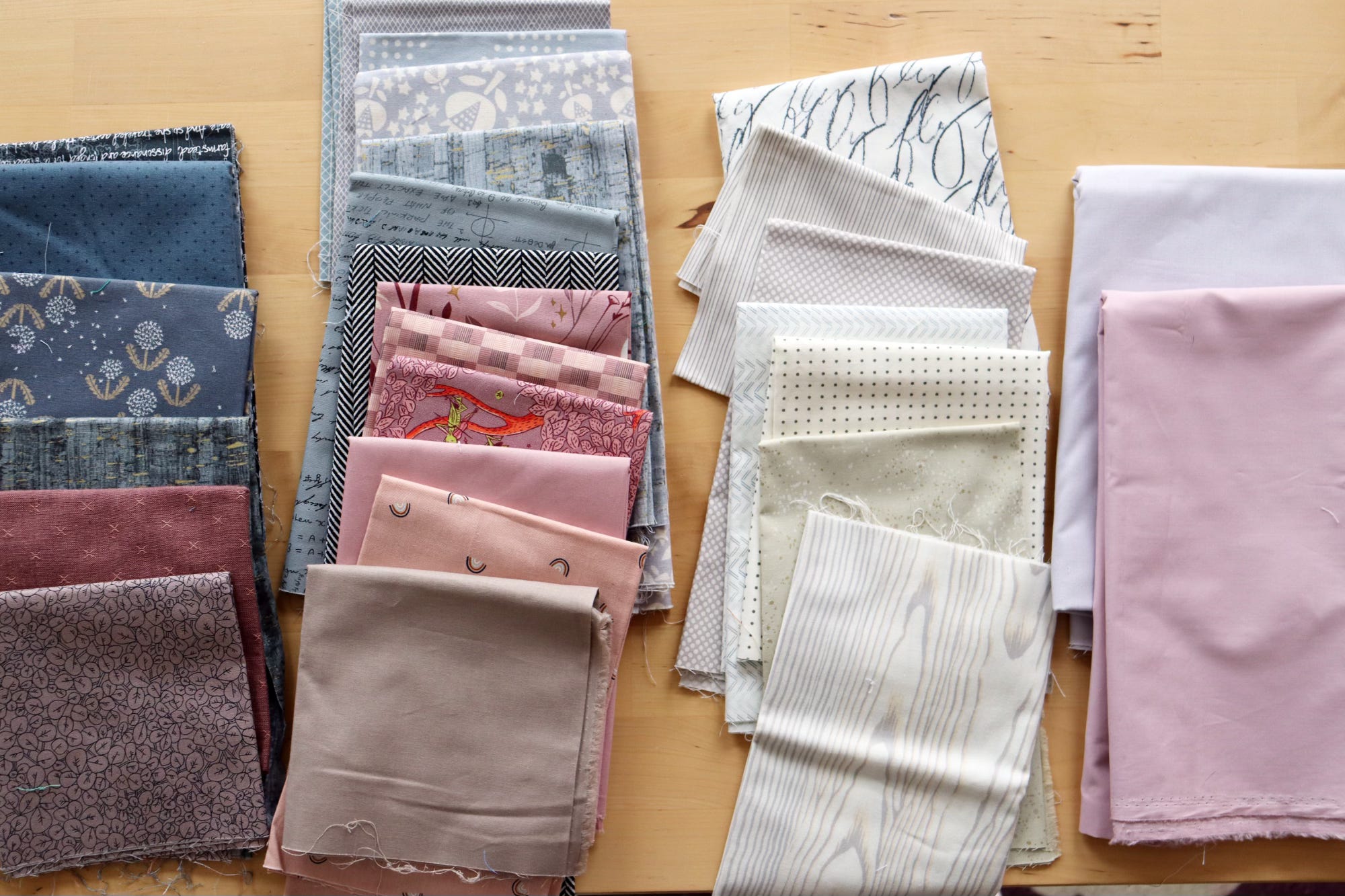
Did you notice that my solid fabrics (far right) are actually darker in value than my low value prints? Hmm. I don’t think this will ruin things, even though I do recommend low value for the solids in the Tapestry Garden quilt pattern. Let’s see what happens when I don’t follow my own directions!
Maybe that’s an accidental metaphor for the sorrow I bring on myself when I don’t follow my feelings. Haha. Um, err.. sorry. It might be like this while I’m sewing this quilt.
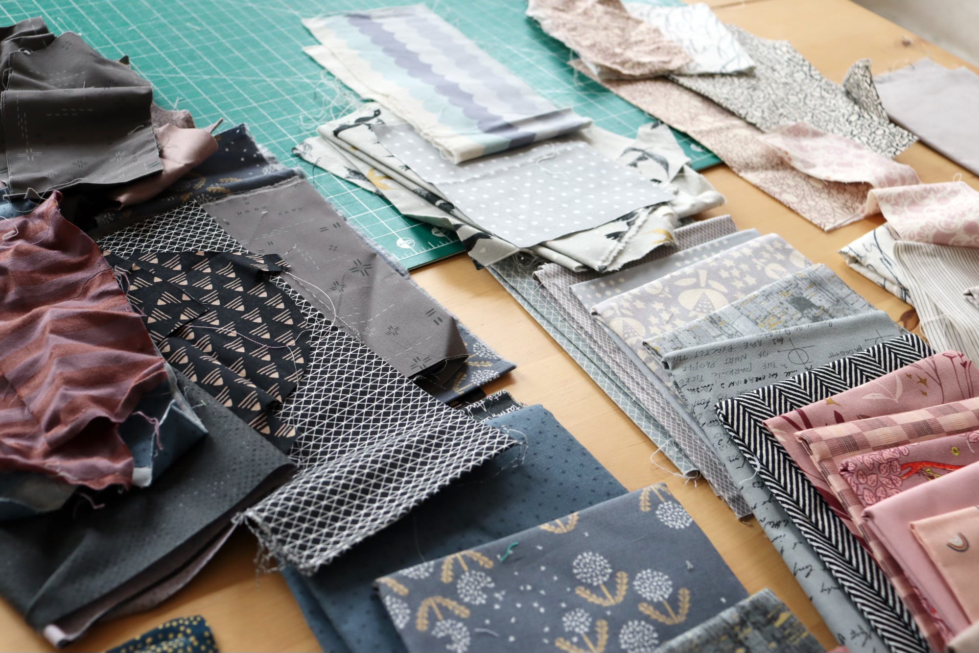
Well, here we go! I’ve trolled my scrap drawers for coordinating scraps and now I’m ready to start cutting and sewing. First up, the Patio group. The January edition of Tapestry Garden block-of-the-month has already delivered to members. They’ll also be sewing Patio this month, which is a great place to start a value-based quilt journey.
Here’s to new years and new beginnings! It’s a great time to join Tapestry Garden BOM. The annual membership is on sale a few more days. Come join us!
p.s. Everyone else is sewing a happy version. Don’t mind me.
I had a similar moment of inspiration myself and arrived at a color array that is similar to yours, I think. I grew up on the central coast of California. I've followed my husband around the continent, from Utah to British Columbia and northern Alberta until we finally settled for good in the central Appalachians, close to where he grew up in Pittsburgh. No matter where I am, I have never stopped missing the Pacific environment of my childhood. My quilt will be the greys, from dark to silver, of the sea and fog, with blues thrown in for the sea and sky. I'll make my solid a wheaty yellow, for the dry grassy hills in summer and my darkest notes will be the greens and rusty browns of the redwoods. I'll brighten it all by making the flowers the colors of California poppies. I never imagined that at the end of a long and eventful life I would find myself in such need of solace and peace, but it's my hope that working on this quilt will afford me that. Your designs and posts are truly inspiring. Thank you.
Although I’m also a fan of brighter colors, there is something calming about a pallet of subtle colors. It’s a good way to challenge yourself by trying something different