Trellis Patchwork
Tapestry Garden in the winter
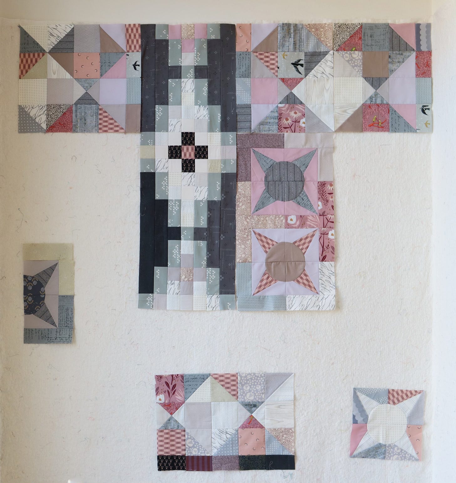
It’s the second month of our year-long Tapestry Garden journey, and club members have just started on Thorn blocks for our modern sampler quilt. I’m working ahead as part of my pattern-production process. This week I sewed the Trellis block!
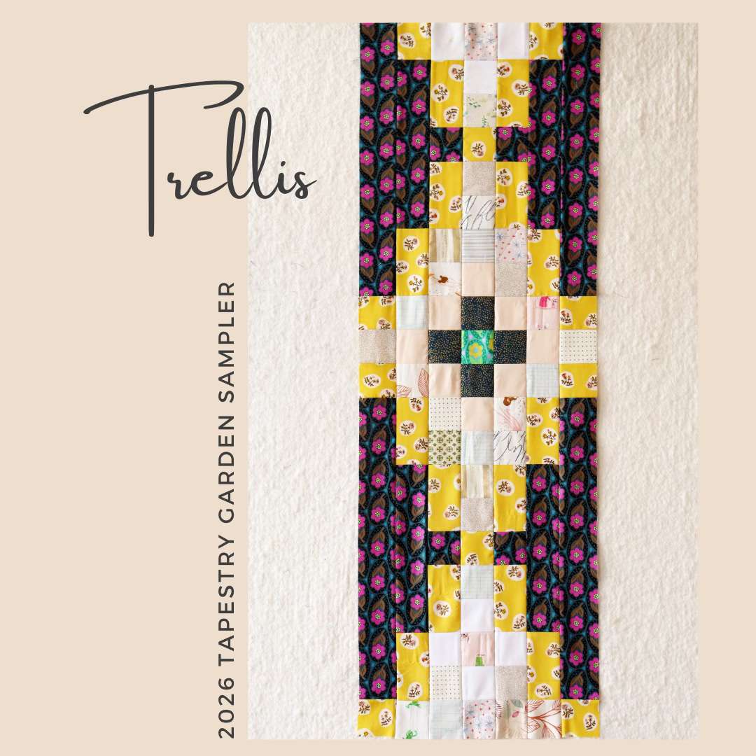
Trellis is a long, vertical block with eye-catching dark values. I made the above rendition for my original Tapestry Garden quilt, with its colorful palette. Now I am working on a somber version of the quilt, a sort of Tapestry Garden in the winter.
It’s worth taking time when choosing fabrics for Trellis. With dark values and fabric repetition, these are fabric choices that will stand out.
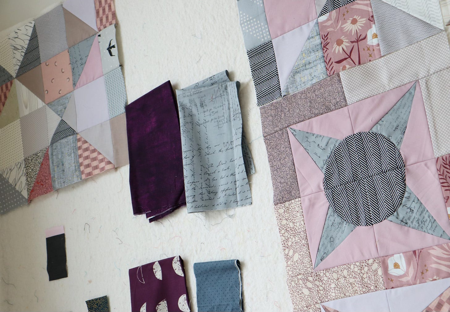
My first idea for the dark value element is a moody eggplant tone, either in the simple texture (above) or the moon print (below). Soon I eliminate the moon print, since the moons would be sliced vertically and look more like odd polka dots in the Trellis block.
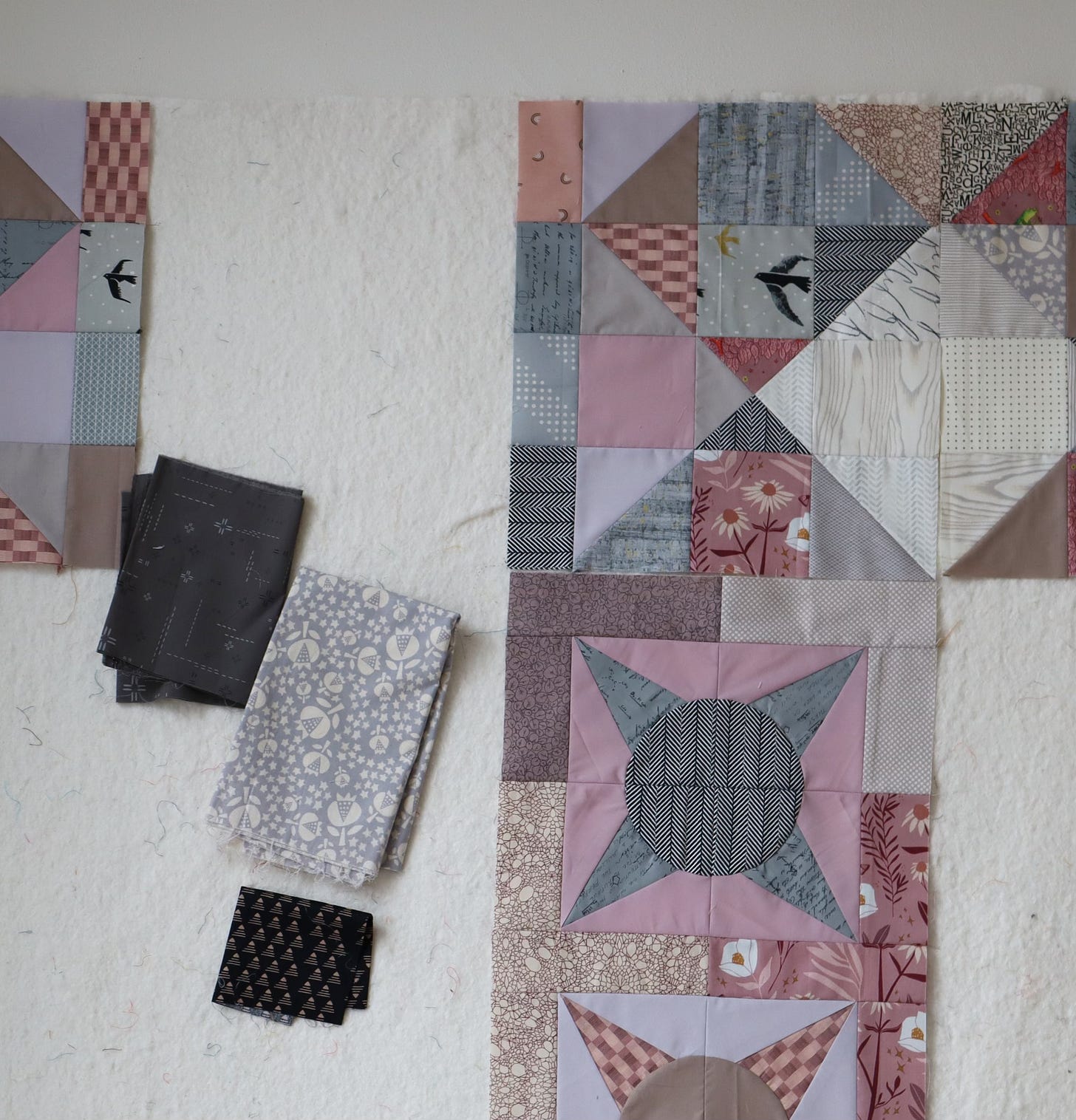
This dark gray Art Gallery Decostitch print is another contender for the Trellis block’s dark value element. I consider pairing it with thie gray/white floral for the medium value element of Trellis. While I love, love, love that floral, it doesn’t read clearly as medium value in the context of my other patchwork. Hmmm…
Here are my two final options. Above is the Decostitch print with a medium value gray and below is the eggplant fabric with a medium value gray. In between is a black print for the dark value Trellis flower.
That photo helps me see that the purple print actually feels too dark in the context of my existing patchwork. Too dark can bring too much contrast, rather than a feeling of cohesion.
Once fabrics are chosen, I cut all the pieces and arrange them on my design all. Yup, I like!
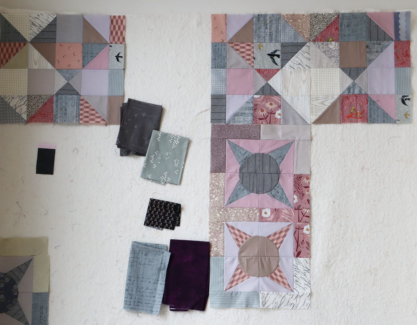
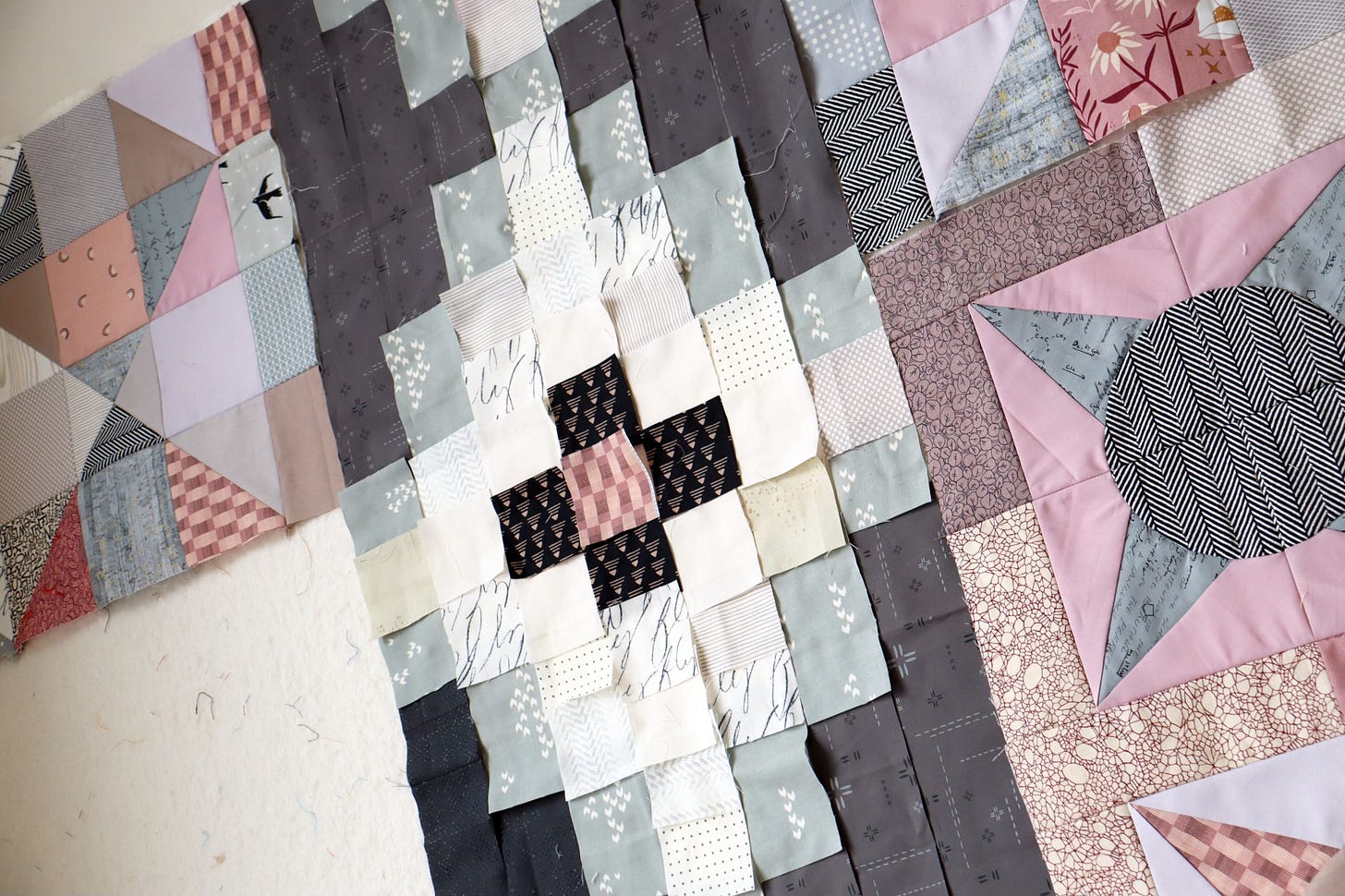
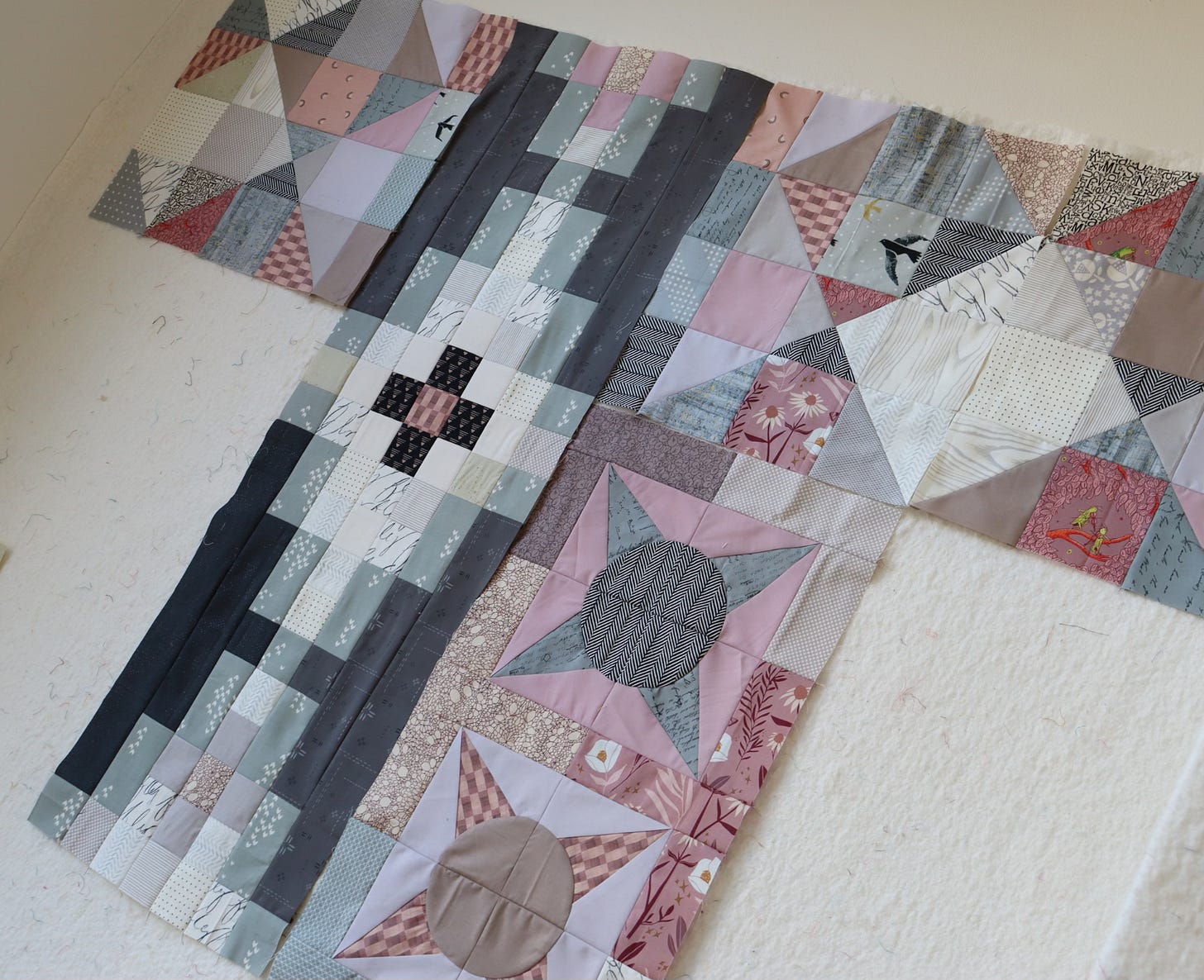
With simple, column-based assembly, Trellis block sews together without fuss. As you can see, the dark value print is certainly dark enough to hold its own in the quilt. I am glad I skipped the even darker eggplant option.
But did you notice that I ran out of the dark gray Decostitch print? At first that was really frustrating, but in the end I like the extra twist that using a different dark gray in the bottom left area gives the block.
That’s so nice about patchwork - mistakes or shortcomings can simply add value. I think that that is often true in life as well. When first confronted with such a pain point, one wants nothing more than to escape it. But, once you accept, adjust and live through it, most painful experiences do add value to the person one is becoming.


I enjoy how you explain the process of selecting the colors and textures. The block s are very pretty. Thanks
Seeing this set now is making me think about the whole colour layout. I dont want to end up with a crazy purple corner and then a wishy-washy blue patch in the opposite corner. I have cut greens and primrose colours with a smidge of brown for the bottom end patio so I can give the big flower a flourish when the time comes. Chose some "organic" K Fassetts for the spikes. The colours are spiky and uncomfortable too. Lots to think about.